Design for the happy travel company, Travalion
- Client
- Travalion
- Involvement
- UX/UI Design, Logo Design, Design System, Development
- Industry
- Travel
- Year
- 2020
Overview
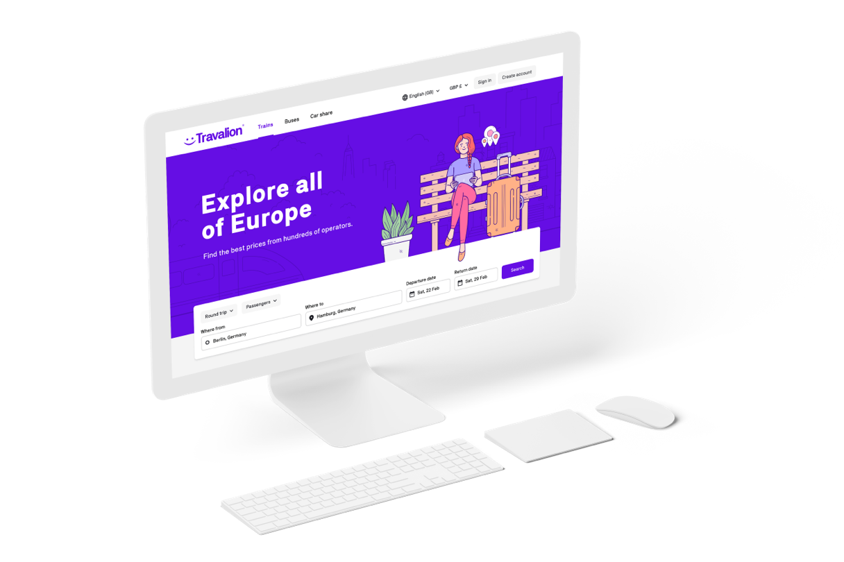
A German startup appointed us to design a complete brand identity package and to develop the entire front-end architecture for the service.
This work included logo design, typography, colour palettes, and a complete set of reusable design components that would form the foundations of the website design and build.
Forming the brand identity
Our sole responsibility was to design a ‘happy’ brand encompassing an energetic, friendly and professional look and feel. In our opinion, a good starting point is with type. A great typeface evokes a level of emotion and is generally used to form a logo.
We searched for a German typeface, something perfectly fitting for a German startup. We were lucky enough to find NB Akademie, a beautiful looking typeface designed by German designer Stefan Gandl. We fell in love with this typeface instantly, as it adopts a style we tend to use in other projects.
Designing the logo
The logo uses the chosen typeface, with a complimentary happy smiley face mark that works well with their strap-line, ‘The Happy Travel Company’.
We were confident the distinct mark would work well with other branding materials, including social shortcut icons and other social media application.

Researching competitors
It’s generally a good move to research competitive websites to see what they are offering and how well they are doing from a visual and a functional perspective. This ensures we have a competitive edge when designing and developing something better.
Creating a design system
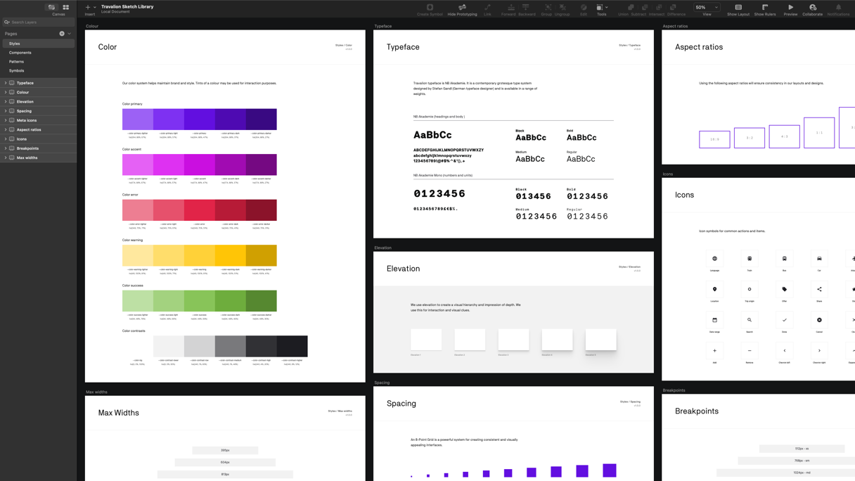
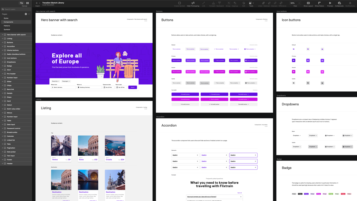
Building a design system go hand in hand with the need for scale, efficiency and consistency. The design system acted as a single source of truth for both design and code. It would ensure that new design patterns and code were more structured and guided to avoid chaos with other people working with it.
“A design system is a collection of reusable components, guided by clear standards, that can be assembled to build any number of applications.”
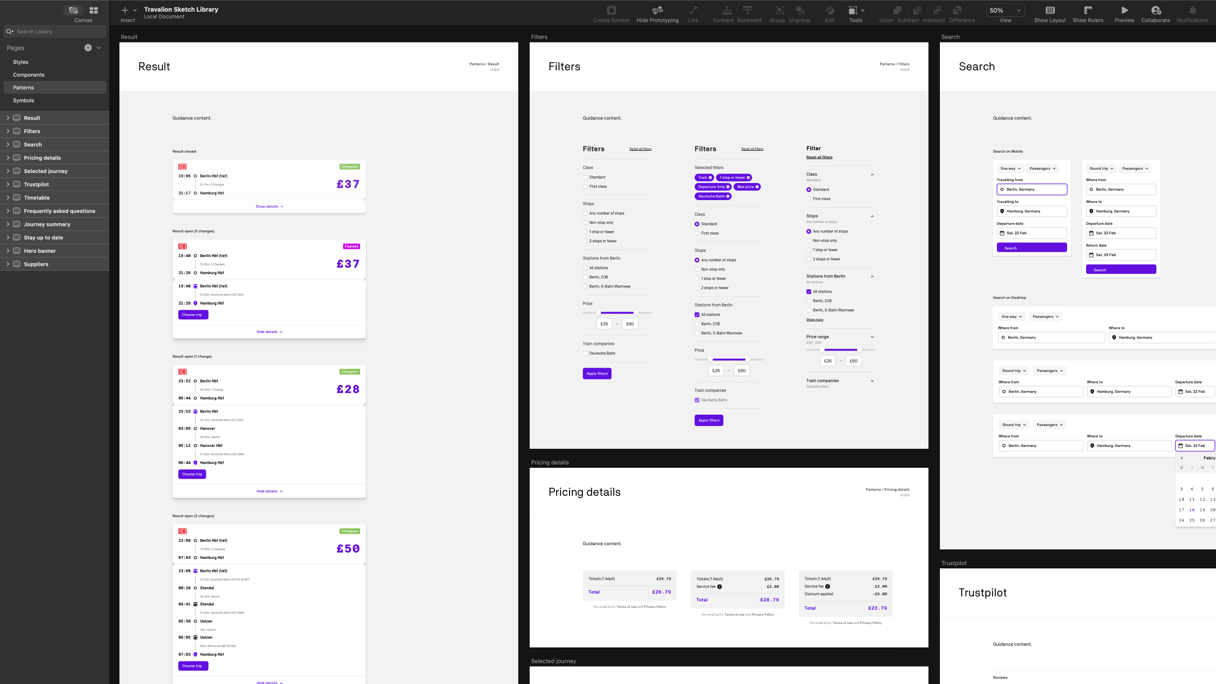
This design system consisted of typography, colour palettes, spacing scale, components, patterns and documentation on using them in the service. We created the design system in two formats, one as an asset library, prepared in Sketch. The other is an interactive coded resource.
The asset library was essential in the design of new pages. Any updates to the library would immediately be reflected in any design files referencing it. The coded resource included code snippets, previews and documentation on how to use the components.
With both assets in place, it made designing and developing pages a quick process. This work reduced inconsistencies in both design and development.
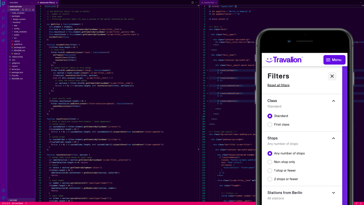
Scaleable blocks of reusable code
Every component carefully built to be responsive, accessible, flexible and production-ready. Typical items included date pickers, accordions, menus, paginations, tabs, filters and many more.
The results
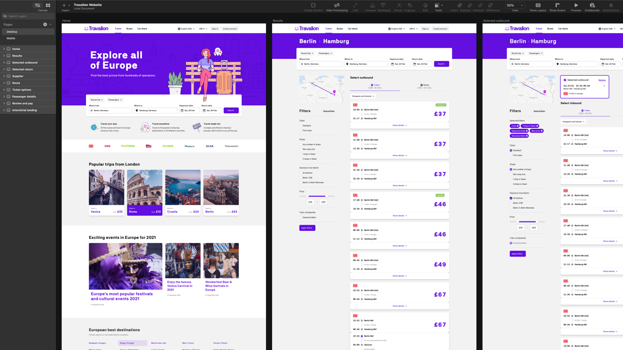
We delivered a clean, attractive and scalable solution that works and looks great on all devices. The flexibility to build new pages has been made possible with clear documentation for future growth.
Our involvement includes:
- UX/UI Design and Interaction Design
- Logo and Brand Design Package
- Design System and User Guides
- Front-End Development
- Accessibility