Helping Government Digital Service with Interaction Design
- Client
- Government Digital Service
- Involvement
- UX/UI Design, Prototyping
- Industry
- Government
- Year
- 2020
Overview
Government Digital Service (GDS) appointed us to help with Interaction Design for Brexit related services, to enable people to prepare for new rules in 2021 now that the UK has left the EU.
They wanted us to join the team due to extensive experience in Government departments and having worked with GDS on several different projects.
We worked on three services:
- Brexit checker
- EU funding
- Double opt-in
Brexit checker
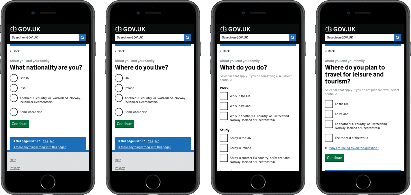
Families and businesses need to know how to deal with the impact of Brexit changes. We aimed to fill this gap by asking them to answer a few questions to get a personalised list of actions.
A considerable amount of user research and testing went into this project. We had a clear understanding of participant views on Brexit and the checker as a service. We were able to use this information to iterate and improve on design and offering.
We worked closely with a content designer to improve the journey of the question and were able to remove any doubt users had with these questions. We prototyped and designed the complete user flow, ready for testing.
User testing and research
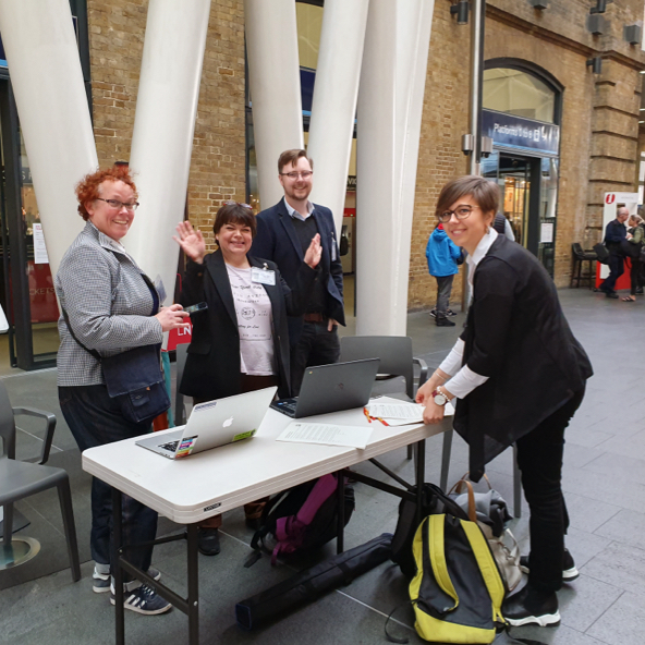
We had many opportunities to test our prototype, which added a lot of value to design decisions.
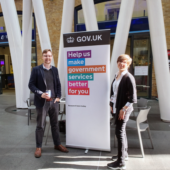
We tested our prototype internally with the collaboration and expertise of our team and performed pop-up testing at King’s Cross station.
We attended an SME business event with Islington Council. We were able to get businesses interacting with our prototype on mobile devices. We would take notes for further discussions with the rest of the team. All user testing was a valuable insight towards delivering a User-Centred Design service.
What we discovered
We found that all participants were aware of the campaign through billboards and online advertising. Participants were broadly reluctant to prepare for Brexit due to either thinking it was not impacting them or because they wanted to get certainty on the outcome first.

Ongoing challenges
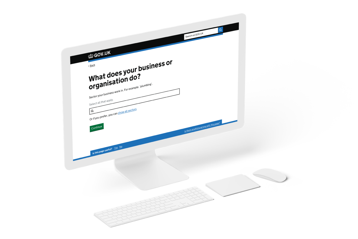
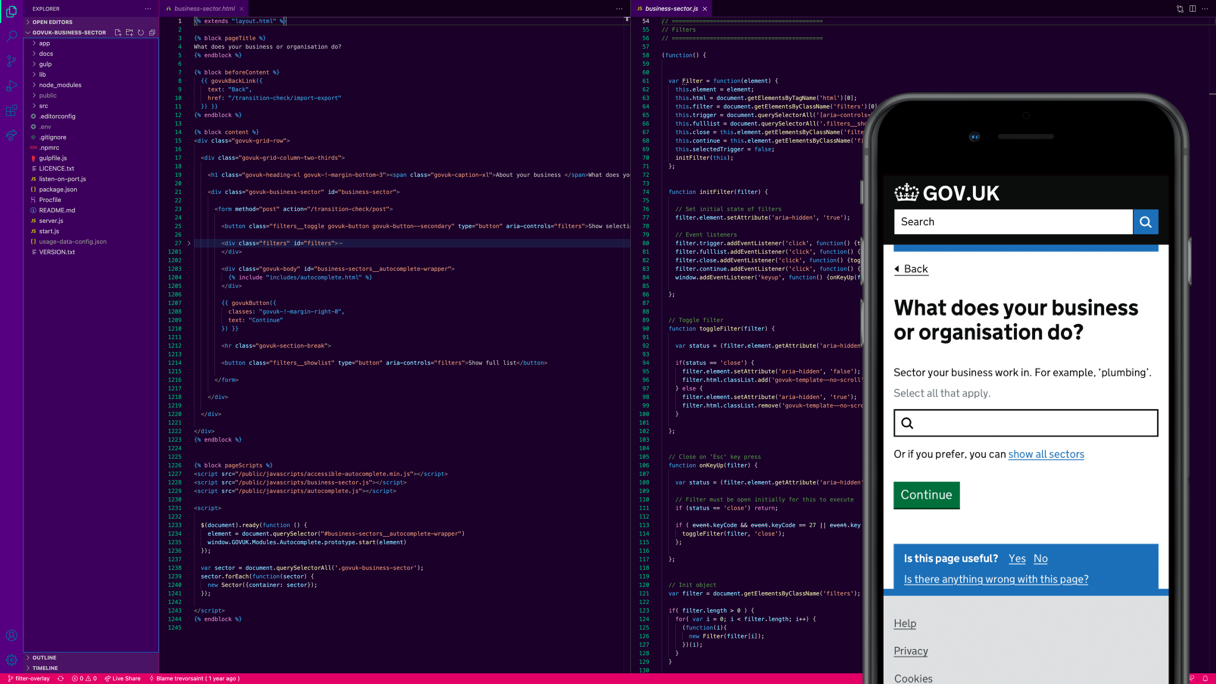
We had many challenges, not just with the Brexit checker as a service, but individual questions. One, in particular, was the ‘business sector’. Research had shown that users found it frustrating finding and choosing options relevant to them.
This challenge meant users would get non-related actions on their results and would also miss out on necessary tasks they needed to do.
Exploration of SIC codes
We determined that we needed to explore further how we could use SIC codes to help businesses find the right sector in the business question of the checker.
SIC codes describe the main business activity when registered at Companies House. Business owners would be more familiar with the wording and terminology used when forming a business.
We felt that we could potentially tap into the Companies House (API) and use that data to help business users identify their sector. We designed and prototyped a solution presented to businesses as an alternative to the question that was not working as expected.
EU funding
UK organisations have been getting funding directly from the EU. The Government guaranteed some of that funding if there was a no-deal Brexit. The problem was that Government departments didn’t know who all of those organisations were, so they wanted them to register.
This process previously consisted of a business completing a spreadsheet and emailing it to the Cabinet office for review. If an organisation met these criteria, it would be eligible for funding.
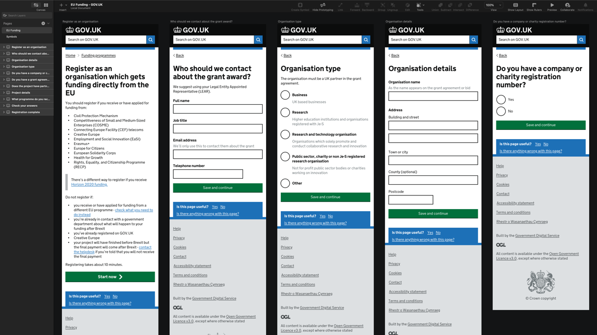
How we did it
We had four days and no time for user research. We combined our collective experience and knowledge of working on many different services over the years and set off with a plan.
We were able to build a prototype using patterns from the GOV.UK Design System. We worked closely with two content designers working different days to keep content clear and easy to understand. The questions were refined and made simple in addition to streamlining the user journey.
With a few days remaining, we were able to make bug fixes, improve error validation and make content tweaks. Developers were then able to work with this prototype as a reference and build the functionality needed to fulfil the task.
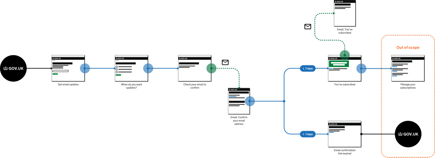
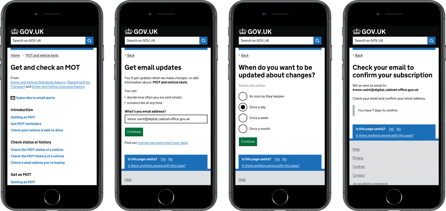
Double opt-in
The team agreed we needed a pattern for a double opt-in feature for our email subscription sign up journey. Initially, we started talking about the sign up for Brexit-centric notifications but quickly realised the potential for an extended service-agnostic pattern that could improve services across GOV.UK.
The reason behind this decision
Legal requirements imposed by GDPR meant we must not send emails to a user without their consent. These rules also govern the storage of personal data. There was also a user need to protect data and help users make informed decisions about signing up.
What is double opt-in?
Double opt-in is a standard feature of email and other subscription journeys as part of an online service.
The existing journey consisted of a poor user experience and was not legally compliant. We proposed a new simplified route with a better user experience and double opt-in functionality.
A user would choose to sign up for alerts or updates and enter their email address. They would then receive an email containing a link they must click to confirm their subscription. In doing this, they validated an email account.
What did we do
We captured all existing notification journeys and agreed we would start with a service agnostic user journey which would bring clarity on purpose; start small etc. We identified requirements page by page and drafted and refined content. We then designed and built a prototype that we tested with users.
We organised research planning sessions, where we analysed the journey from a user perspective. We then built a list of user research questions of things we wanted to confirm. We then tested the prototype again and made refinements and improvements based on those findings.
What we delivered
Due to technical constraints and time pressures, we had to deliver a minimum viable product (MVP) version of our prototype. Our MVP improved the user journey and included the double opt-in feature but did not include everything we had hoped.